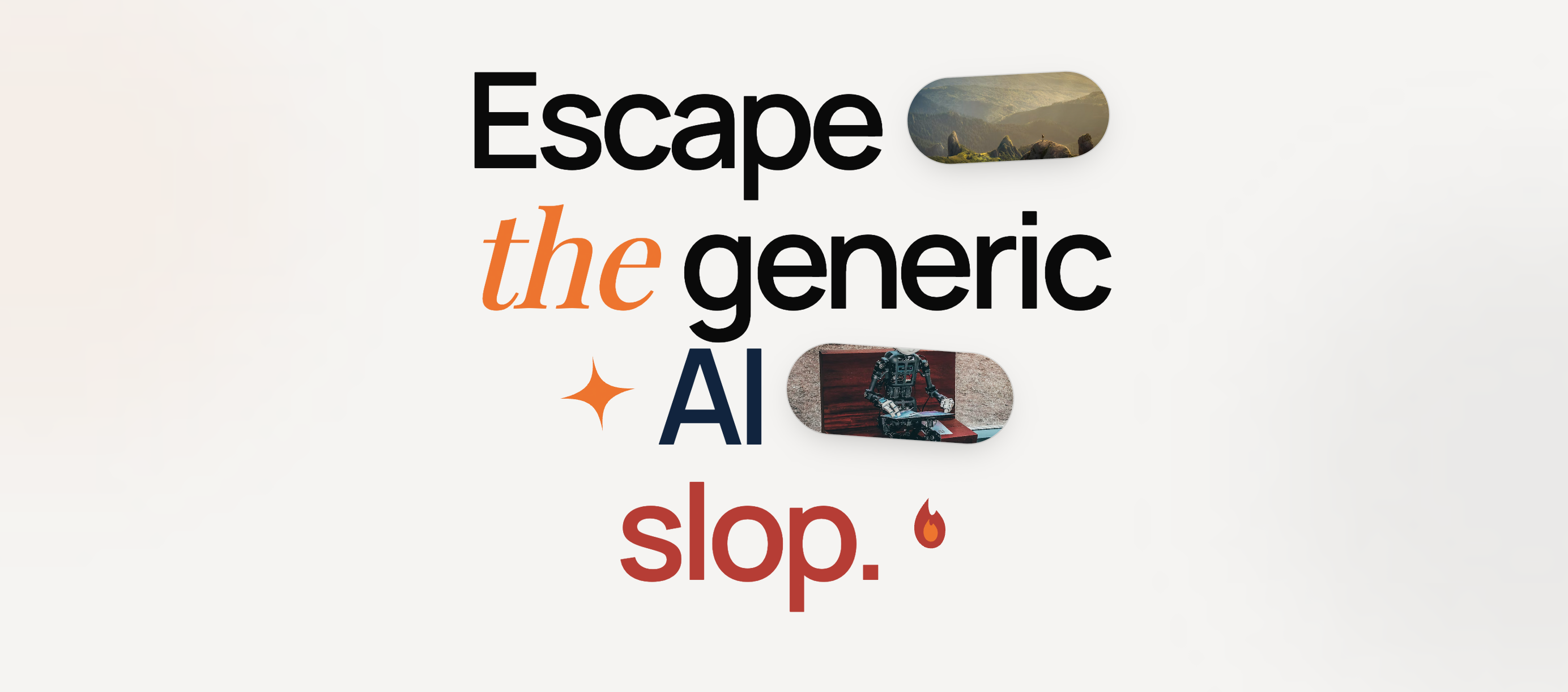
Taste Skill: Teaching AI Agents to Stop Building the Same Purple Landing Page
Ask Claude Code, Cursor, or Codex to “build me a SaaS landing page” and you’ll get the same site you got last week. Rounded cards with a drop shadow. A purple-to-blue gradient hero. Inter at 16px. Three equal feature cards in a row. A “Get Started Free” button centered under a generic tagline.
It works. It also looks like every other AI-generated frontend on the internet.
The fix when you already have a brand is straightforward: codify your design system into a file the agent reads first. But what about the greenfield case? What about teams shipping new products with AI agents who don’t have an established visual language yet?
That’s where Taste Skill comes in. It doesn’t describe your brand. It describes what good design looks like, period. And it does it by telling the agent what to stop doing.
It occupies the same layer as tools like Impeccable and Anthropic’s built-in frontend-design skill, but takes a more radical stance: instead of nudging the agent toward better defaults, it flat-out bans the common failure modes.
The Slop Problem Has a Shape
If you’ve reviewed more than a dozen AI-generated UIs, you start seeing the same failure modes everywhere. They’re predictable enough to catalog:
| Failure Mode | What It Looks Like | Why It Happens |
|---|---|---|
| AI Purple | #7C3AFF to #3B82F6 gradient on everything | Most popular in training data |
| Three-Card Syndrome | Features always in 3 equal columns | Statistically safest layout |
| Inter Everywhere | Default sans-serif, no typographic personality | Zero-cost safe choice |
| Fake Screenshots | div with rounded corners pretending to be a product image | Agent can’t generate real images |
| Warm Beige DTC | Cream + brass + espresso on every consumer site | ”Premium” pattern over-represented |
| Repeated Eyebrows | Every section starts with “Our Features”, “Why Us”, “How It Works” | Filler structure from templates |
| Zig-Zag Syndrome | Alternating image-left/text-right, image-right/text-left forever | Simple pattern to repeat |
None of these are technically broken. They’re just the mean of what the model has seen.
The agent isn’t making design decisions. It’s averaging.
What Taste Skill Actually Is
Taste Skill is not a component library, not a Tailwind plugin, not a Figma file. It ships as SKILL.md files. Portable Markdown instructions that any AI coding agent can load before it starts generating code. The install is one command:
npx skills add https://github.com/leonxlnx/taste-skillOr target a specific variant:
npx skills add https://github.com/leonxlnx/taste-skill --skill "design-taste-frontend"The repo contains over a dozen skills, each tuned for a different aesthetic lane:
| Skill | Install Name | Use Case |
|---|---|---|
| Default (v2) | design-taste-frontend | General-purpose anti-slop for any frontend |
| GPT/Codex variant | gpt-taste | Stricter rules for GPT-family models |
| High-end visual | high-end-visual-design | Premium, calm, whitespace-heavy UI |
| Minimalist | minimalist-ui | Editorial product UI (Linear/Notion vibes) |
| Brutalist | industrial-brutalist-ui | Swiss type, hard mechanical language |
| Redesign | redesign-existing-projects | Audit + fix existing UIs |
| Image-gen (web) | imagegen-frontend-web | Reference boards, not code |
| Image-gen (mobile) | imagegen-frontend-mobile | Mobile screen references |
The key insight: these aren’t themes. They’re constraint systems. The agent reads the SKILL.md and knows what it’s not allowed to do before it decides what it will do.
The Design Read: Forcing the Agent to Think First
The core mechanism in Taste Skill v2 is what it calls a “Design Read.” Before the agent writes a single line of code, it has to produce a one-liner that captures the brief’s context: page type, audience, vibe, and constraints.
This is the same principle behind chain-of-thought prompting, applied to design. Instead of jumping straight to <div className="bg-gradient-to-r from-purple-500">, the agent pauses and asks: what kind of page is this? Who’s it for? What should it feel like?
That pause changes everything.
A “Design Read” for a fintech dashboard produces completely different output than one for a DTC skincare brand. Without it, both get the same purple gradient.
After the Design Read, three global dials govern the output:
DESIGN_VARIANCE:  1-10  (1 = centered/clean, 10 = asymmetric/experimental)
MOTION_INTENSITY: 1-10  (1 = hover states only, 10 = scroll-driven/magnetic)
VISUAL_DENSITY:   1-10  (1 = spacious, 10 = dense dashboards)
Different products get different presets:
| Product Type | VARIANCE | MOTION | DENSITY | Result |
|---|---|---|---|---|
| B2B SaaS dashboard | 3 | 2 | 4 | Clean, functional, restrained |
| Creative agency portfolio | 8 | 7 | 3 | Asymmetric, animated, spacious |
| Government services | 2 | 1 | 6 | Symmetric, static, information-dense |
| DTC brand launch | 6 | 5 | 2 | Expressive, smooth, editorial |
The dials don’t change the skill’s rules. They tell the agent how aggressively to apply them.
The Anti-Slop Ruleset
Here’s where Taste Skill gets opinionated enough to be interesting. The SKILL.md contains hard rules that read more like a senior designer’s code review than a style guide:
Typography discipline:
- Inter is banned as a lazy default
- Serif fonts require explicit justification
- Fraunces and Instrument Serif are forbidden as “generic display” choices
- The agent must pick typography that matches the brief’s audience and tone
Color calibration:
- The warm beige + brass + espresso “premium DTC” palette is explicitly banned
- AI Purple (the
#7C3AFFto#3B82F6gradient) is flagged as an LLM tell - Generic glassmorphism without contextual justification is rejected
- Color must serve hierarchy, not decoration
Layout constraints:
- Heroes must fit in the initial viewport. No scrolling to find the CTA.
- Navigation must fit on one line. If it doesn’t, the IA is wrong.
- No endless zig-zag image/text sections
- No repeating the same layout family across the page
- Strict caps on hero copy length
Motion rules:
- Every animation must be motivated: hierarchy, feedback, or storytelling
prefers-reduced-motionis mandatory, not optional- Canonical GSAP/Motion skeletons provided for sticky stacks and horizontal pans
- No motion for motion’s sake
The skill even ships canonical animation patterns. Instead of letting the agent invent scroll animations from scratch (which usually means random fade-in on every element), it provides tested skeletons:
// Taste Skill's canonical sticky-stack pattern (motion/react)
<motion.section
  style={{ position: "sticky", top: 0 }}
  initial={{ opacity: 0, scale: 0.96 }}
  whileInView={{ opacity: 1, scale: 1 }}
  transition={{ duration: 0.5, ease: [0.22, 1, 0.36, 1] }}
  viewport={{ once: true, amount: 0.4 }}
>
  {/* section content */}
</motion.section>
The easing curve ([0.22, 1, 0.36, 1]) and the viewport.amount threshold aren’t random. They’re the kind of details a motion designer would specify. The skill encodes them so the agent doesn’t have to guess.
Image strategy:
div-based fake screenshots are banned outright- Priority order: image-gen tools, then real photography/placeholder URLs
- If neither is possible, leave an explicit
TODOrather than faking it
Each rule directly targets a specific LLM failure mode.
The ban on Inter isn’t about Inter being a bad font. It’s about Inter being what the model defaults to when it hasn’t thought about typography at all.
Before and After: What Changes
The difference isn’t subtle. Consider what a generic “build me a project management tool landing page” produces without and with Taste Skill loaded:
| Dimension | Without Taste Skill | With Taste Skill |
|---|---|---|
| Typography | Inter 16px everywhere | Geist for UI, tight tracking on display headings |
| Hero | Full-viewport gradient, centered copy, generic CTA | Compact hero that fits above the fold, specific value prop |
| Color | Purple-to-blue gradient, white cards | Muted palette derived from brief context, accent used sparingly |
| Layout | Three equal feature cards, then zig-zag sections | Varied section structures, no repeated layout family |
| Images | div with rounded corners + gradient pretending to be a screenshot | Explicit placeholder or image-gen TODO, no faking |
| Motion | Random fade-in on scroll | Motivated transitions tied to hierarchy |
Here’s what the hero markup difference looks like in practice.
Without Taste Skill (the agent’s default instinct):
<section class="min-h-screen bg-gradient-to-r from-purple-600 to-blue-500
               flex items-center justify-center text-center px-4">
  <div class="max-w-3xl">
    <p class="text-sm uppercase tracking-widest text-purple-200 mb-4">
      Project Management Reimagined
    </p>
    <h1 class="text-5xl font-bold text-white mb-6">
      The All-in-One Platform for Modern Teams
    </h1>
    <p class="text-xl text-white/80 mb-8">
      Streamline your workflow, boost productivity, and deliver
      projects on time with our AI-powered solution.
    </p>
    <button class="bg-white text-purple-600 px-8 py-4 rounded-full
                   text-lg font-semibold hover:shadow-xl">
      Get Started Free
    </button>
  </div>
</section>
With Taste Skill loaded (same prompt, same model):
<section class="pt-24 pb-16 px-6 max-w-5xl mx-auto">
  <div class="grid grid-cols-[1fr_0.8fr] gap-16 items-start">
    <div>
      <h1 class="text-[3.25rem] leading-[1.08] font-medium
                 tracking-[-0.035em] text-slate-900">
        Ship projects without<br/>the status meetings.
      </h1>
      <p class="mt-5 text-lg text-slate-600 max-w-[38ch]">
        Replaces standups with async updates your team
        actually reads. 4-minute setup.
      </p>
      <div class="mt-8 flex gap-3">
        <a href="/signup" class="bg-slate-900 text-white px-5 py-2.5
                                 text-sm font-medium rounded-md">
          Start free trial
        </a>
        <a href="/demo" class="text-slate-700 px-5 py-2.5 text-sm
                               font-medium border border-slate-200
                               rounded-md">
          Watch 2-min demo
        </a>
      </div>
    </div>
    <!-- TODO: product screenshot via image-gen or real asset -->
    <div class="aspect-[4/3] bg-slate-100 rounded-lg"></div>
  </div>
</section>
The differences are structural, not cosmetic:
- No full-viewport gradient hero. Content fits above the fold.
- Specific copy (“Ship projects without the status meetings”) instead of generic platitudes.
- Tight negative letter-spacing on the heading (
-0.035em), not default. - Explicit
TODOfor the image instead of faking a screenshot with a gradient div. - Two CTAs with different weights instead of one centered pill button.
- Asymmetric grid (
1fr 0.8fr) instead of dead-center alignment.
The output isn’t always prettier in an obvious way. But it looks intentional. Like someone made decisions rather than accepted defaults.
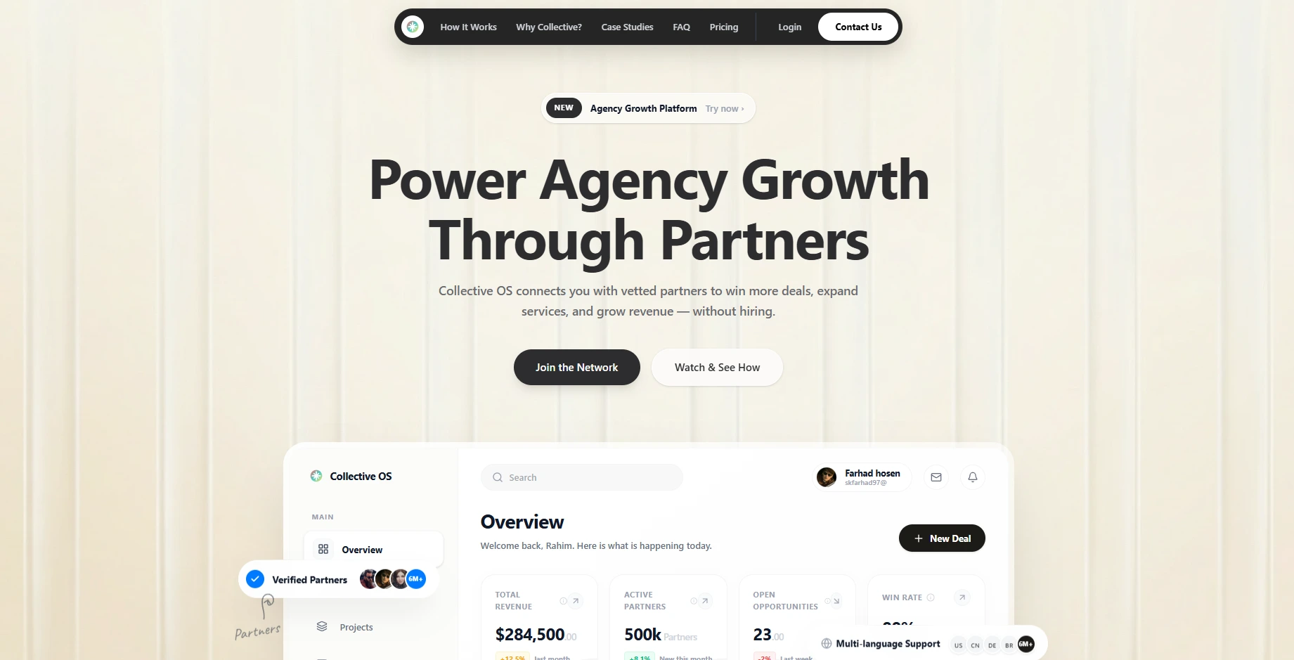
What the Output Actually Looks Like
Theory is nice. Here’s what Taste Skill-generated pages look like in practice. These are from the project’s showcase, built entirely by AI agents with the skill loaded:
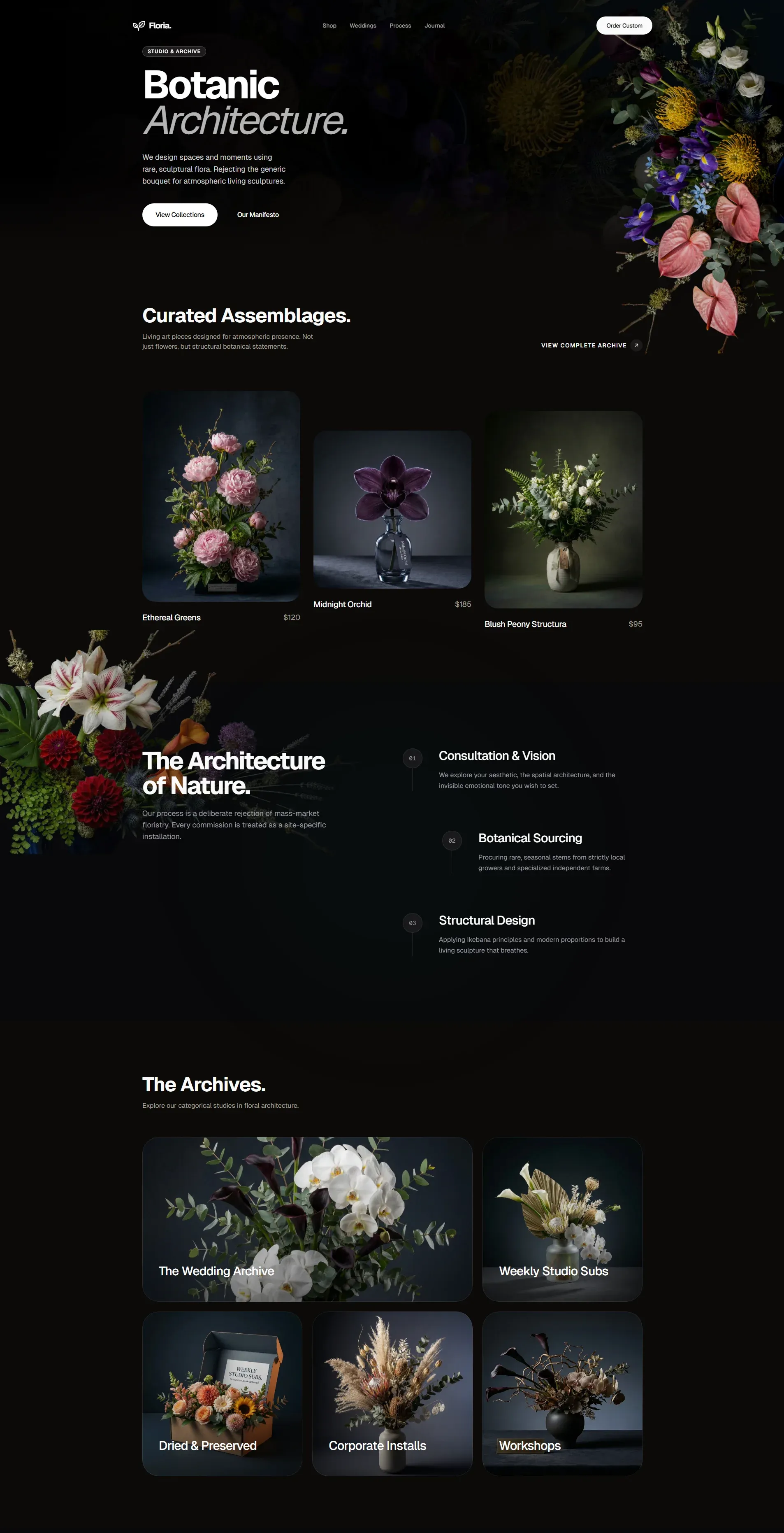
Notice what’s absent: no purple gradient, no centered three-card grid, no Inter, no zig-zag sections. What’s present: intentional typography with weight contrast, asymmetric layout, restrained color usage, whitespace that serves hierarchy rather than filling viewport height.
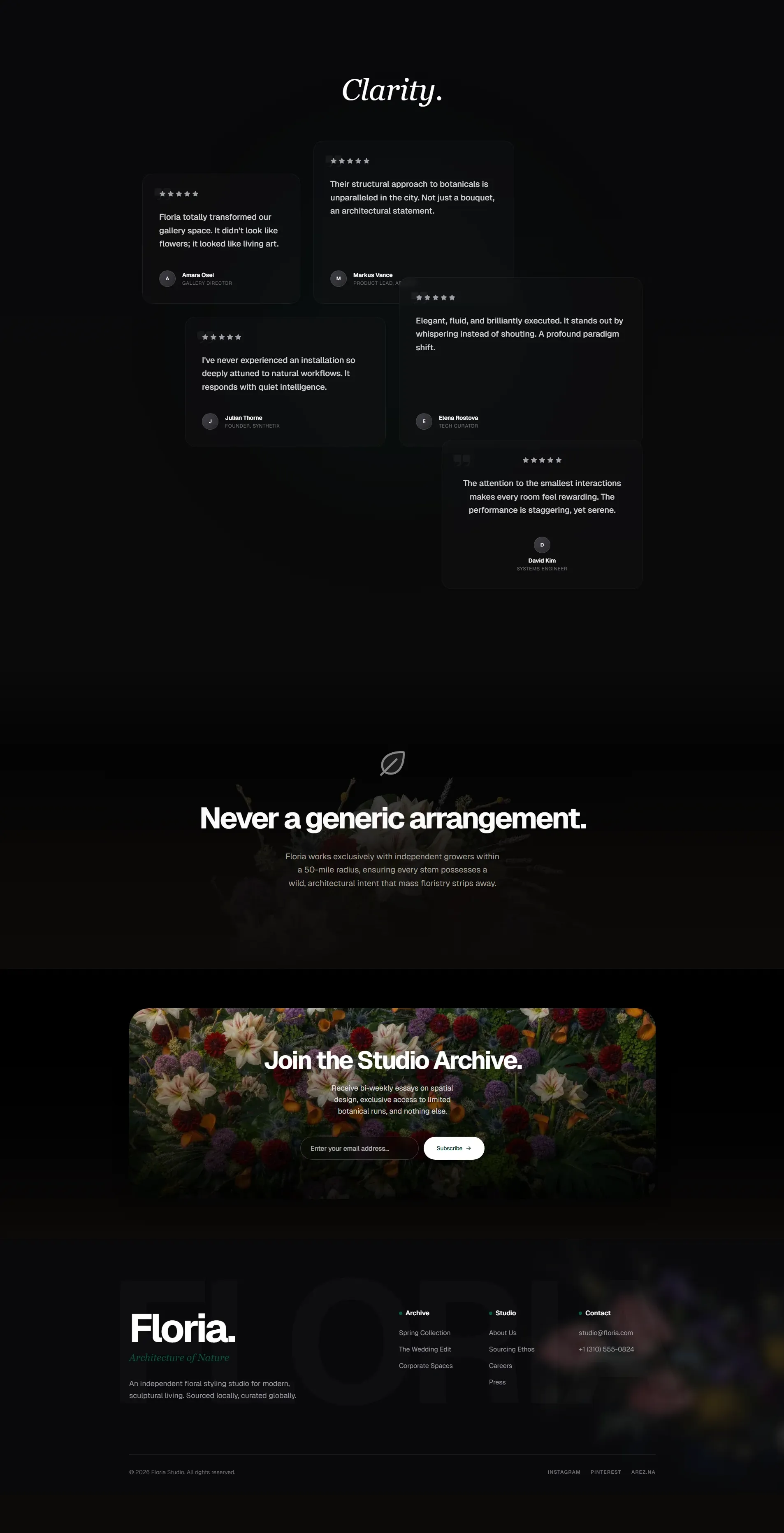
Here’s a second example from a different aesthetic lane:
Same skill, different brief, completely different output. The dials (DESIGN_VARIANCE, MOTION_INTENSITY, VISUAL_DENSITY) and the Design Read produce distinct results because the constraints adapt to context rather than enforcing a single look.
Fitting It Into an Agent Workflow
If you’re already using Claude Code or Cursor, integration is trivial. The skill file lands in your project’s skills/ directory after npx skills add. The agent picks it up automatically when it starts a frontend task.
For Claude Code specifically, you can reference it in your CLAUDE.md:
## Frontend Generation
Before writing any UI component, load the taste-skill SKILL.md.
Apply its rules for typography, color, layout, and motion.
Use the Design Read pattern before generating any page-level UI.
For custom agent frameworks or multi-agent pipelines, you inject the SKILL.md content into the system prompt or retrieve it as a document before the frontend-generation step.
The interesting question is where this fits architecturally in a multi-agent system:
┌──────────────┐     ┌──────────────┐     ┌──────────────┐
│  Planner     │     │  Backend     │     │  Frontend    │
│  Agent       │────▶│  Agent       │────▶│  Agent       │
│              │     │              │     │              │
│  reads:      │     │  reads:      │     │  reads:      │
│  PRD.md      │     │  API spec    │     │  SKILL.md ◀──── taste-skill
│  CLAUDE.md   │     │  CLAUDE.md   │     │  DESIGN.md   │
└──────────────┘     └──────────────┘     └──────────────┘
Design taste becomes another input to the system, not a post-hoc review. The same way you feed an agent your API spec or testing conventions, you feed it design constraints.
Agent Skills as Design Infrastructure
Here’s the broader point that matters if you’re building agentic systems at scale.
We already treat coding standards, linting rules, and CI checks as infrastructure. They encode quality expectations into automated systems so humans don’t have to enforce them manually in every code review. Taste Skill does the same thing for visual design. It encodes “this is what good looks like” and “this is what slop looks like” into a format that agents consume automatically.
The distribution mechanism matters too. Taste Skill ships through the Vercel Agent Skills registry. Other registries like Tessl and Awamer index it. This is the beginning of a world where design skills get versioned, evaluated, and composed just like npm packages. You don’t install one massive framework. You compose the specific constraints your project needs.
design-taste-frontend  → general anti-slop rules
+ minimalist-ui        → editorial product aesthetic
+ output-skill         → full output enforcement (no truncation)
That’s three SKILL.md files totaling maybe 2000 tokens of context. The return on those tokens is every frontend task in your project producing output that doesn’t look like it was generated by a committee of training data averages.
Who This Actually Helps (And What It Doesn’t Replace)
Here’s my honest take after integrating design skills into my own agent workflows.
Taste Skill helps developers shipping products without a dedicated designer. Solo founders, small teams, indie hackers using Cursor or Claude Code to build their entire frontend. These people aren’t choosing between “good design” and “bad design.” They’re choosing between “AI slop” and “slightly less AI slop.” Taste Skill moves them meaningfully up that spectrum.
It also helps teams where the designer sets direction but agents do the volume work. A designer creates the system. DESIGN.md captures the tokens. Taste Skill prevents the agent from drifting into generic patterns when it builds the 47th page that the designer never explicitly mocked up.
What it does not do is replace designers. Not even close.
A SKILL.md can tell an agent “don’t use purple gradients” and “make the hero fit in one viewport.” It cannot tell an agent why the checkout flow should surface trust signals before the price, or that this particular audience needs larger touch targets because they’re using the app one-handed while commuting, or that the brand’s personality should feel “confident but not loud.” Those are judgment calls. They come from user research, business context, and the kind of spatial intuition that takes years to develop.
Taste Skill eliminates the mechanical failures. The typography that wasn’t thought through. The layout that repeats because the model ran out of ideas. The color that means nothing.
Those are problems of execution, not vision. A SKILL.md handles execution. Vision still requires a human.
This tracks with what research keeps showing: experienced practitioners don’t hand the reins to the agent. They set constraints and supervise. Taste Skill is exactly that pattern applied to design. The human provides taste and judgment. The skill encodes the guardrails. The agent does the volume work within those boundaries.
The human touch isn’t just “nice to have.” It’s the difference between a product that looks polished and a product that feels right. No amount of anti-slop rules will give an agent empathy for the user. But those rules will stop it from making the obvious mistakes that signal “nobody reviewed this.”
Where This Goes Next
Taste Skill targets landing pages and product UIs today. But the pattern generalizes. Dashboard design has its own set of slop patterns (the endless bento grid, the gratuitous donut chart, the meaningless KPI card with a green arrow). Data visualization has another set. Email templates, mobile flows, voice UI surfaces. Each domain has its own “mean of the training data” problem.
The teams that ship distinctive products with AI agents won’t be the ones with the best models. They’ll be the ones with the best constraints.
Design taste isn’t something you can train into a foundation model. But you can encode it into a 500-line Markdown file that sits in your repo and shapes every piece of UI your agents produce.
The model provides capability. The skill provides taste. The combination is what produces work that actually looks like someone gave a damn.
Building frontends with AI agents? I’d love to hear how you handle the “everything looks the same” problem. Reach out on LinkedIn.